Pulse Analytics
A multi-variant analytics dashboard with interactive data visualizations

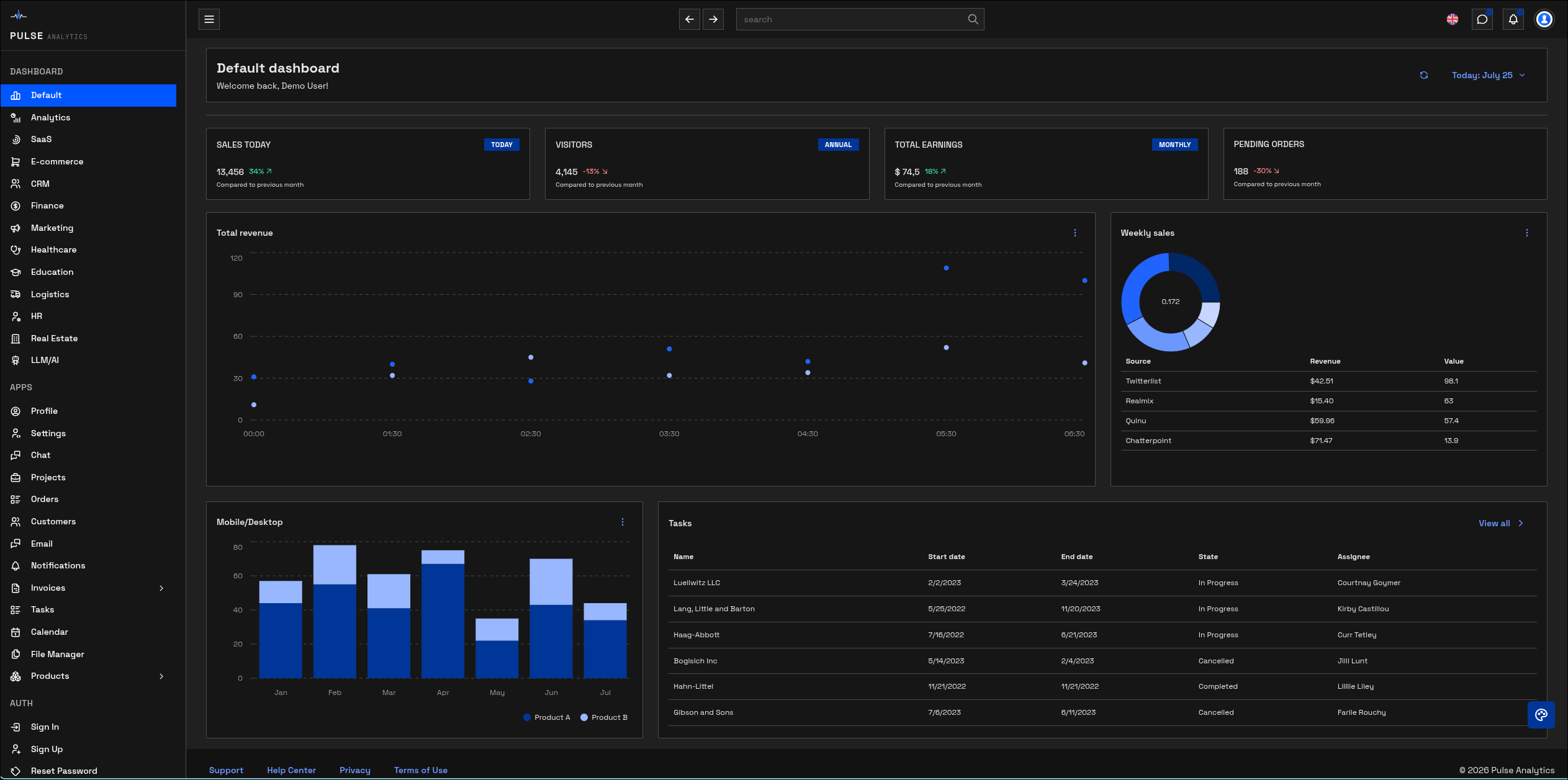
Pulse Analytics is a dashboard application designed to visualize complex datasets through multiple layout variants. The idea was to build a single platform that can present the same underlying data in fundamentally different ways — summary cards, detailed tables, interactive charts — letting users switch between views based on their current task.
Next.js was chosen for its server-side rendering capabilities, ensuring fast initial page loads even with data-heavy views. Mantine UI provides the component foundation with a clean, professional aesthetic that suits data-dense interfaces without feeling cluttered.
Recharts handles all data visualization — line charts, bar charts, area charts, and pie charts — with smooth animations and responsive sizing. NextAuth provides authentication with role-based access control, ensuring different users see different levels of data granularity.
The application uses Next.js App Router with server components for data fetching and client components for interactive widgets. This hybrid approach means the page shell and initial data load happen server-side, while chart interactions and filter controls run entirely on the client.
Dashboard layouts are implemented as composable grid configurations. Each variant defines a grid template and a set of widget slots. Widgets are self-contained React components that receive data through a shared context provider, making it possible to rearrange them without modifying the widgets themselves.
NextAuth handles session management with JWT tokens. Role-based access is enforced both at the middleware level (protecting routes) and at the component level (conditionally rendering sensitive data). This dual-layer approach ensures security even if a component is accidentally exposed.